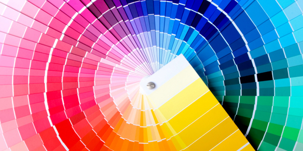
Let old colors be forgot—emerald, we’re looking at you. Emerald was chosen as the color of the year for 2013 by Pantone, the leading industry expert in all things color. As the year comes to an end, it’s time to look forward to the hottest colors of 2014. Predictions for the new year range from specific colors, like pastel gray-blue, to broader themes, like industrial-contrasted-with-natural. Here is what some of the leading experts have to say about color in 2014.
Pantone Predicts Blues and Purples
Though the official Pantone color of 2014 has yet to be announced, the company has unveiled their Spring 2014 report, which is strongly influenced by the spring collections of influential fashion designers. The report focuses on blues and purples—specifically, Placid Blue, Dazzling Blue, Hemlock (a green-y blue), Violet Tulip and Paloma (a dusty violet-blue). These more tranquil and traditional spring colors are contrasted with pops of bright colors, like yellow, orange and red.
Benjamin Moore Believes in Pastels
The color experts at paint company Benjamin Moore have assembled a palette of 23 colors in their trend predictions for 2014. Their conclusion? The world is ready for color, albeit in soft, pastel forms. Their take on pastel is a far cry from sickly sweet candy colors or cliché Easter egg tones. The pastels of 2014 are soft. They lift your spirit without shouting too loud: think a supportive and encouraging friend, not a bossy know-it-all. Colors like “Breath of Fresh Air” (a soft, light blue) and “Van Deusen Blue” (a navy-gray) lead their trend prediction, alongside “Lavender Mist”, “Peach Parfait” and “Mt. Rainier Gray”, which looks just like they sound.
PPG Industries is Seeing Yellow
PPG Industries, makers of paints and coating (among other industrial products) have selected a buttercream yellow as their color of the year for 2014. Soft, pastel and creamy, buttercream yellow was chosen for its feeling of warmth and tranquility and its versatile use as a neutral color, if you will. Other trends they predict: design inspired by the harmony between man and nature; dynamic and geometrical patterns, shapes and prints; earthy, primitive and raw colors; and regal browns, purples and blues used as accents.
Sherwin-Williams Hedges Their Bets
Sherwin-Williams’ color forecast for 2014 suggests a few different themes.
The first, Reasoned, is all about smoky grays. Think early morning mist; the color of the sky before a storm hits; driving at night through thick fog. In their words, “gray is the new black”.
The Intrinsic theme offers a little more variety, containing bright colors with a slightly grown-up feel. The earthy pops of color have a distinct Bohemian vibe and are said to be inspired by the traditional dyeing techniques of native cultures.
The Curiosity palette once again brings up the theme of harmonizing man-made (industrial, mechanical colors) with nature (earthy tones). This collection mostly shies away from color, favoring robotic blues, grays, blacks and whites punched with tan.
Finally, the Diaphanous collection suggests delicateness and softness. This collection of ethereal pinks has a very bridal feeling.
Be Inspired
Don’t rush out to redecorate your house in the colors of 2014—use these trends as inspiration. The more permanent elements of design in your home should be based on colors that are timeless to you. Focus on colors you know you love. Look to your wardrobe to get a sense of what colors you gravitate towards naturally. Incorporate trends and risky colors in elements that are easier to change: slip covers, decorative pillows, throws and accessories are a good place to “try on” color. If you still love it come 2015, look into inviting these colors into your walls or more expensive pieces of furniture.


